Bully Boy
Rum Cooperative Packaging
role: design director & illustrator
Services: branding, art direction, illustration
TEAM: FAIR FOLK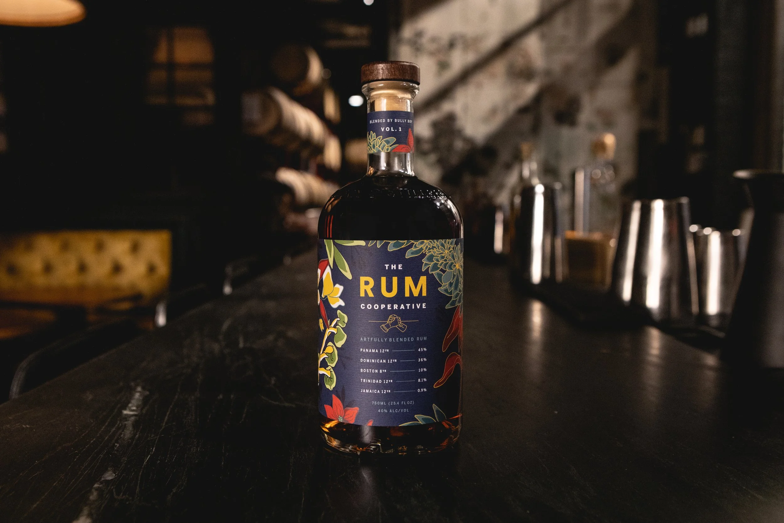
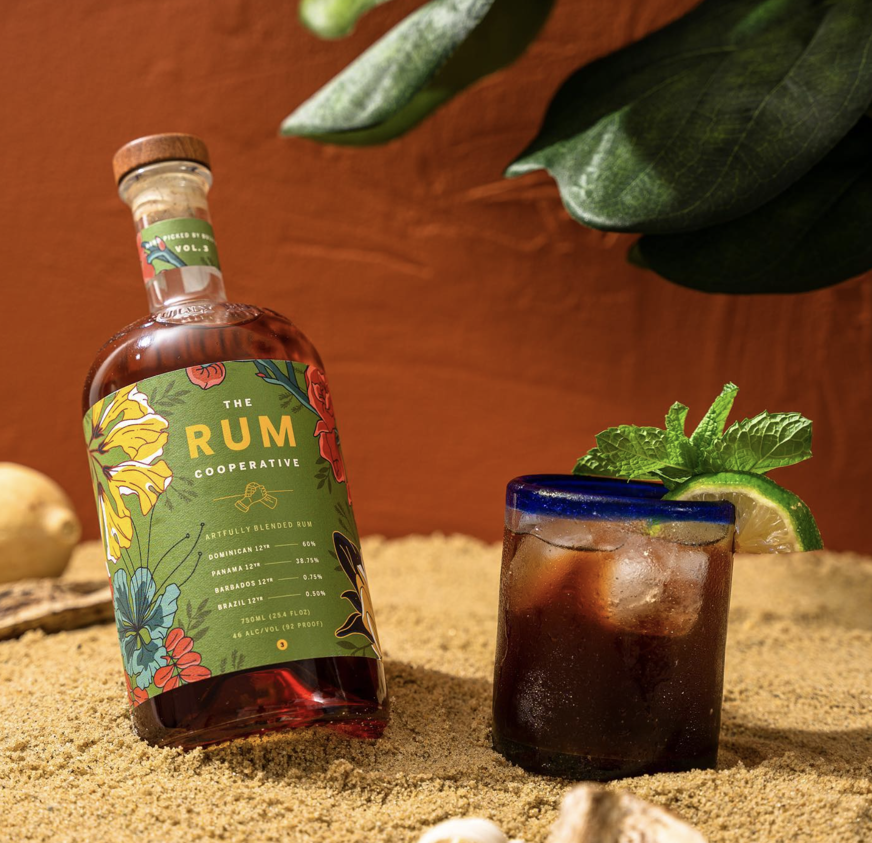
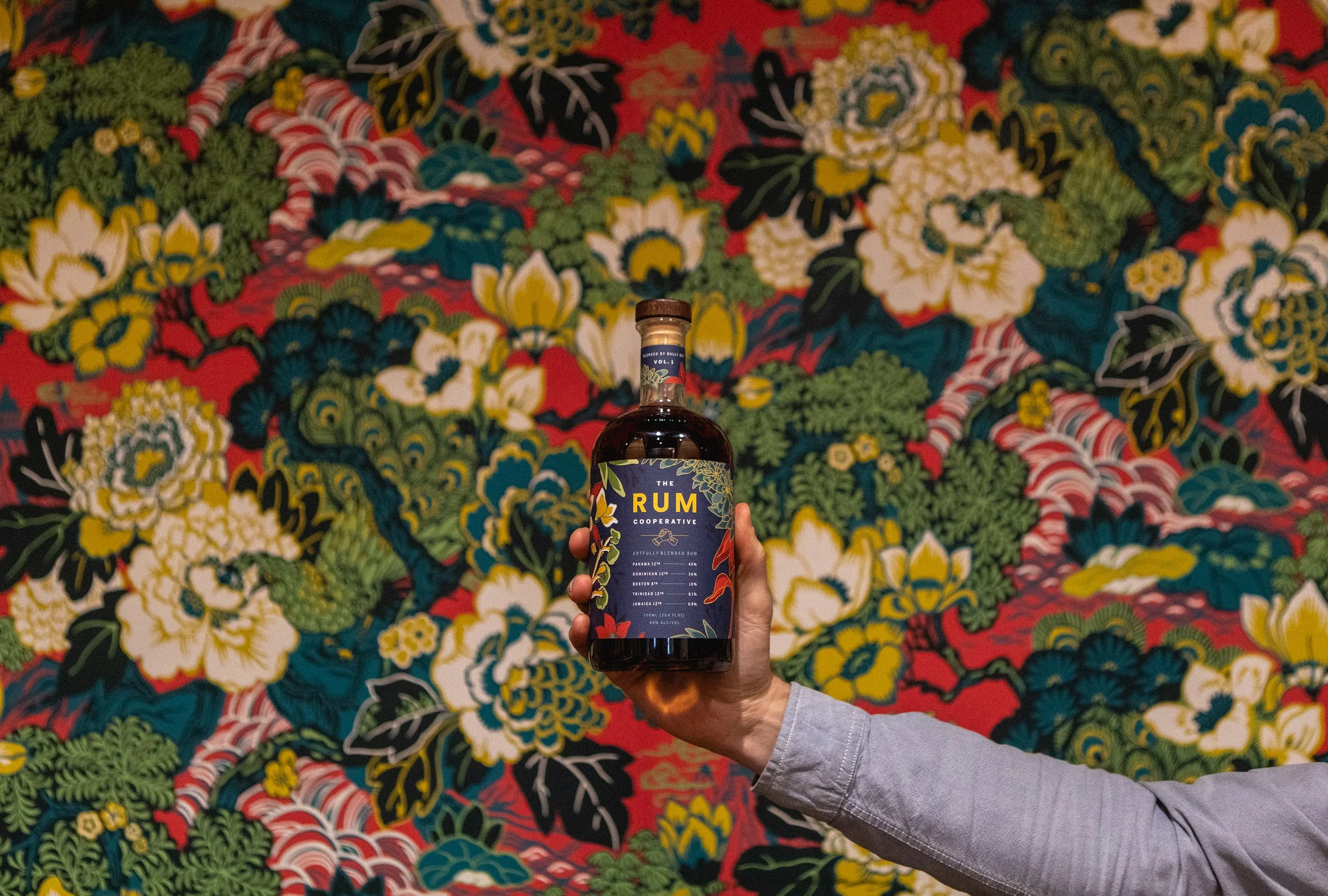
The Rum Cooperative is a spin-off series from Will and Dave of Bully Boy Distillers, blending rums from around the world with their own Boston rum. Each brings its own character to a patchwork of complex aromas and flavors, working in harmony with the others.
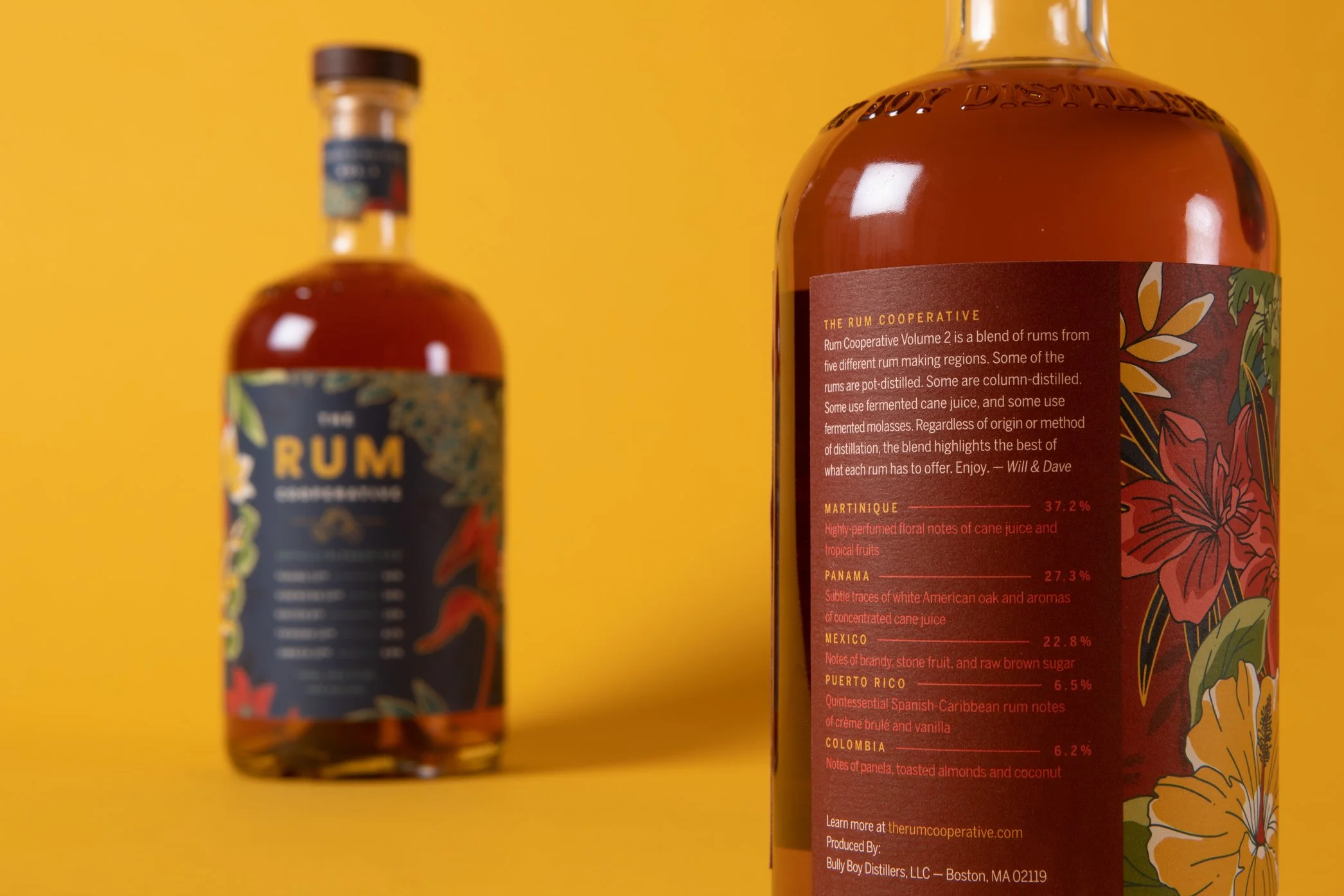
The label puts The Rum Cooperative front and center, with a smaller Bully Boy logo giving the collective—and each rum within it—the attention it deserves.
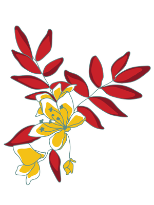
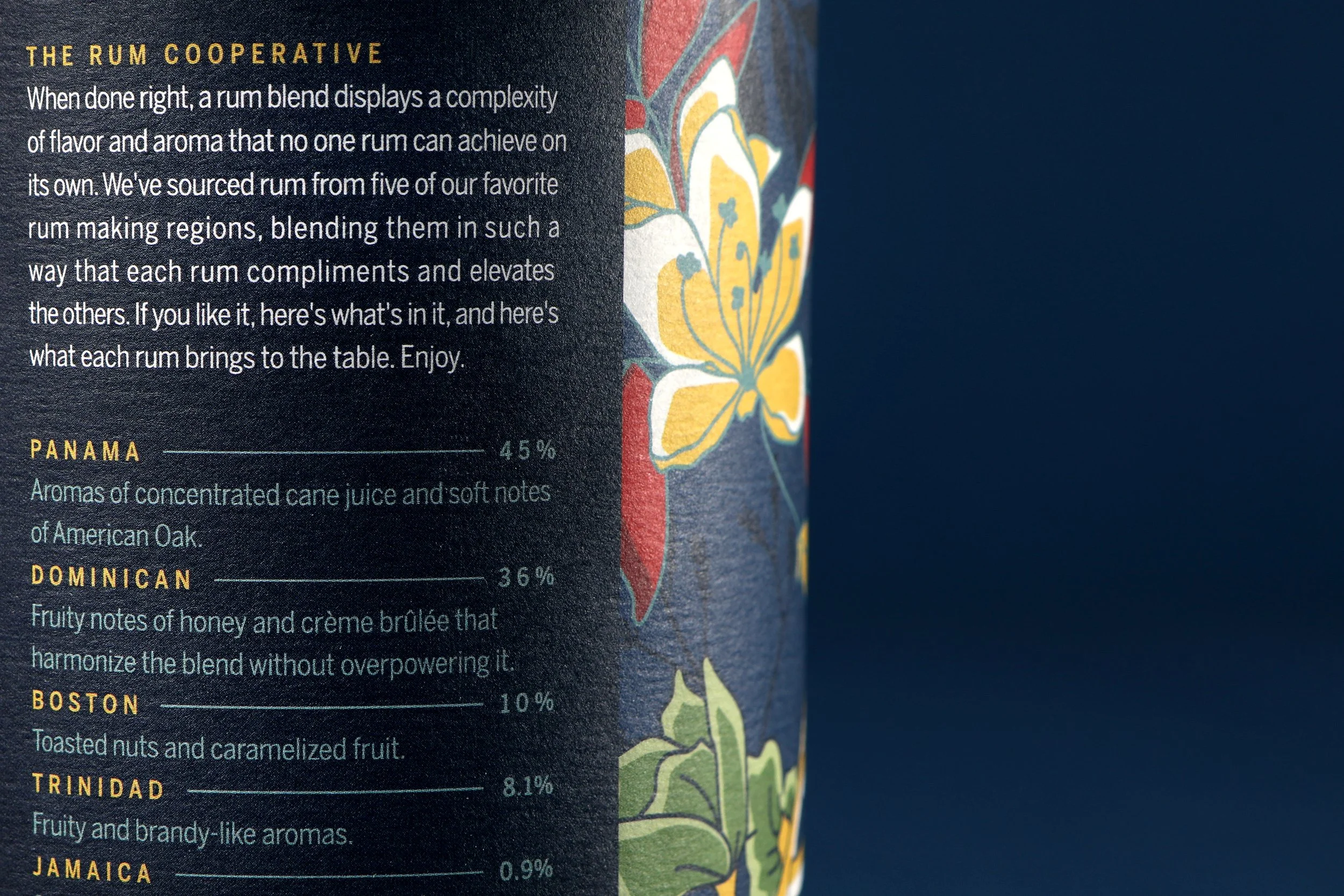
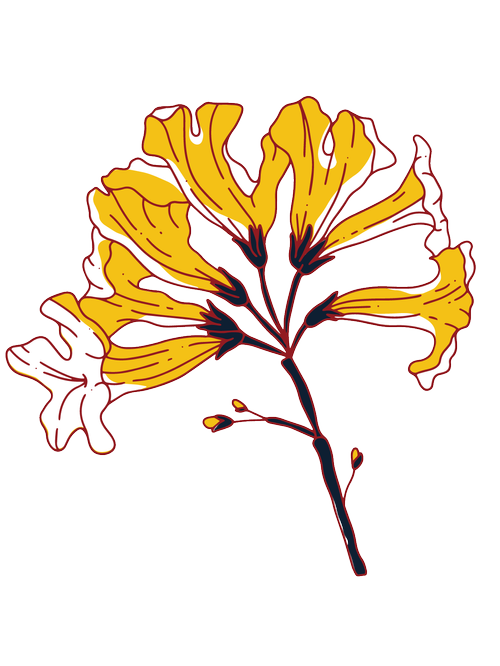
The illustrationThe labels across all three volumes showcase plants native to their respective regions. Some are familiar, like the Massachusetts mayflower, while others feel beautifully unexpected—just like the rum flavors themselves.
The colors and styles are inspired by Bully Boy’s gorgeous tasting room. The wallpaper itself is a thing of beauty!
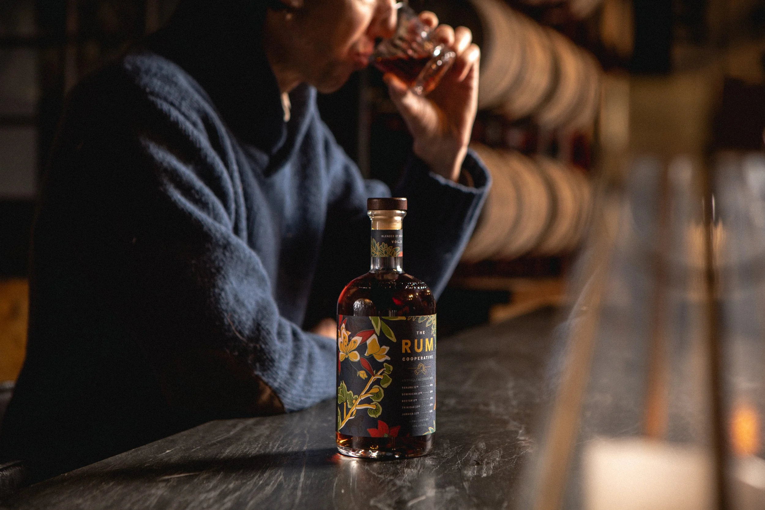
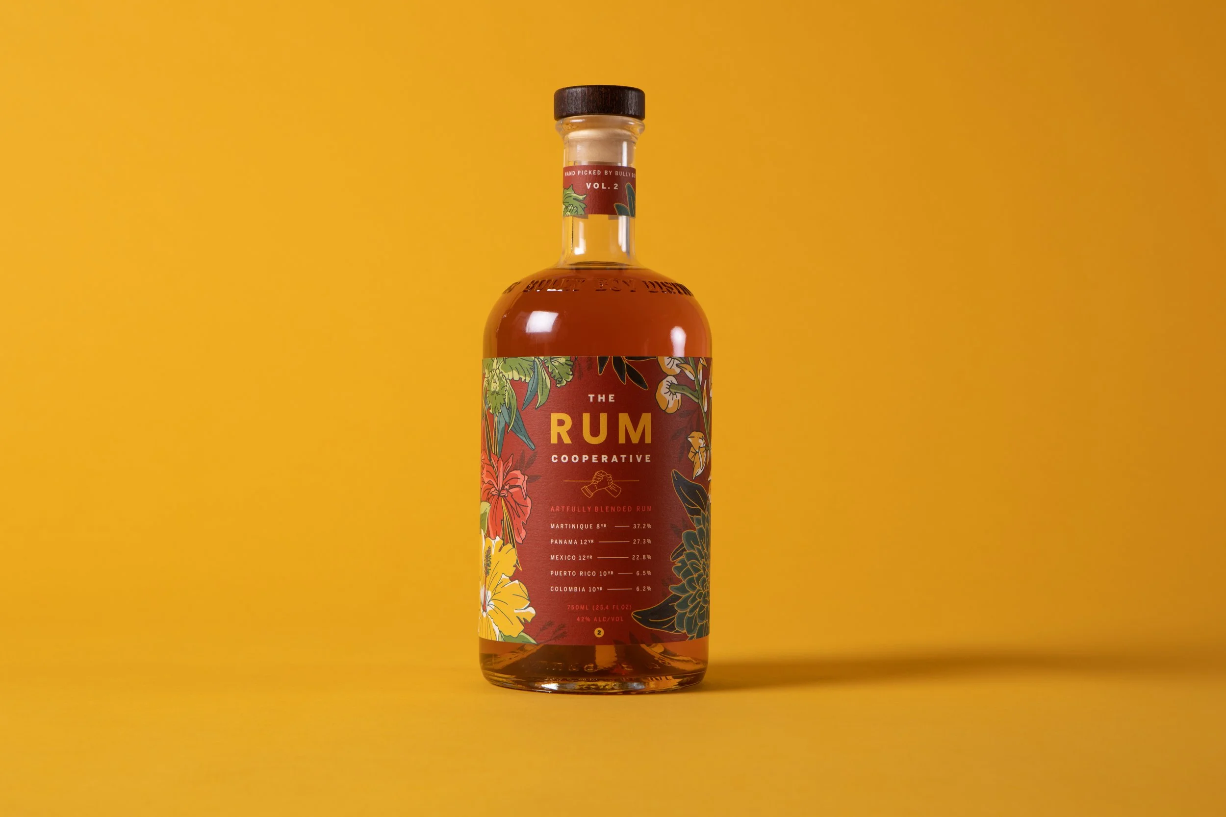
volume twoVolume one of The Rum Cooperative was such a hit that two was born. The same rules applied to the label as volume 1 — native flowers, rum percentages, and a bold colored background that helps differentiate from volume 1.
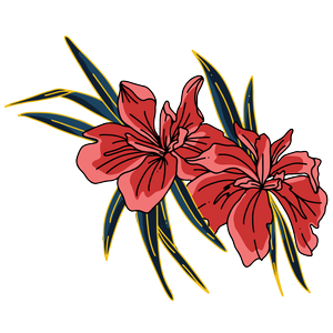
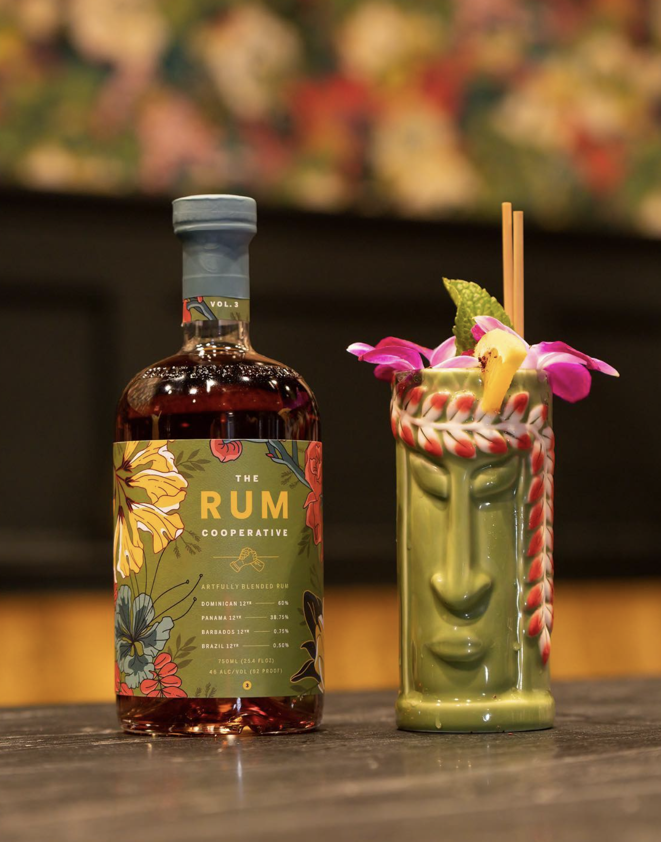
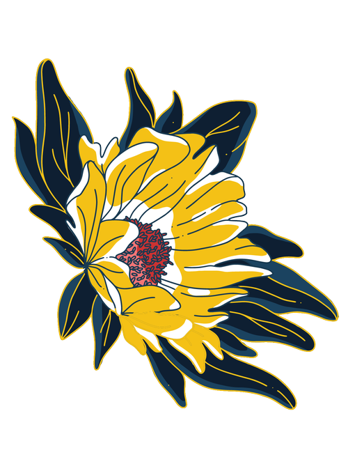
volume threeThe latest and greatest in the series features the native flowers of a new blend, paired with a bright green background to indicate it is the third in the series.