Picnic Cannabis Co. Identity
role: design director & illustrator
Services: branding, art direction, illustration
TEAM: FAIR FOLK
Founded by a group of neighbors and friends in Turners Falls, Massachusetts, Picnic is a cannabis brand with a welcoming spirit. As cannabis consumers themselves, the founders wanted to move away from the “big cloud” energy common in the industry and create something clean, approachable, and open to everyone, whatever their ritual.
They reached out for naming, brand identity, and a website to help bring their vision to life.
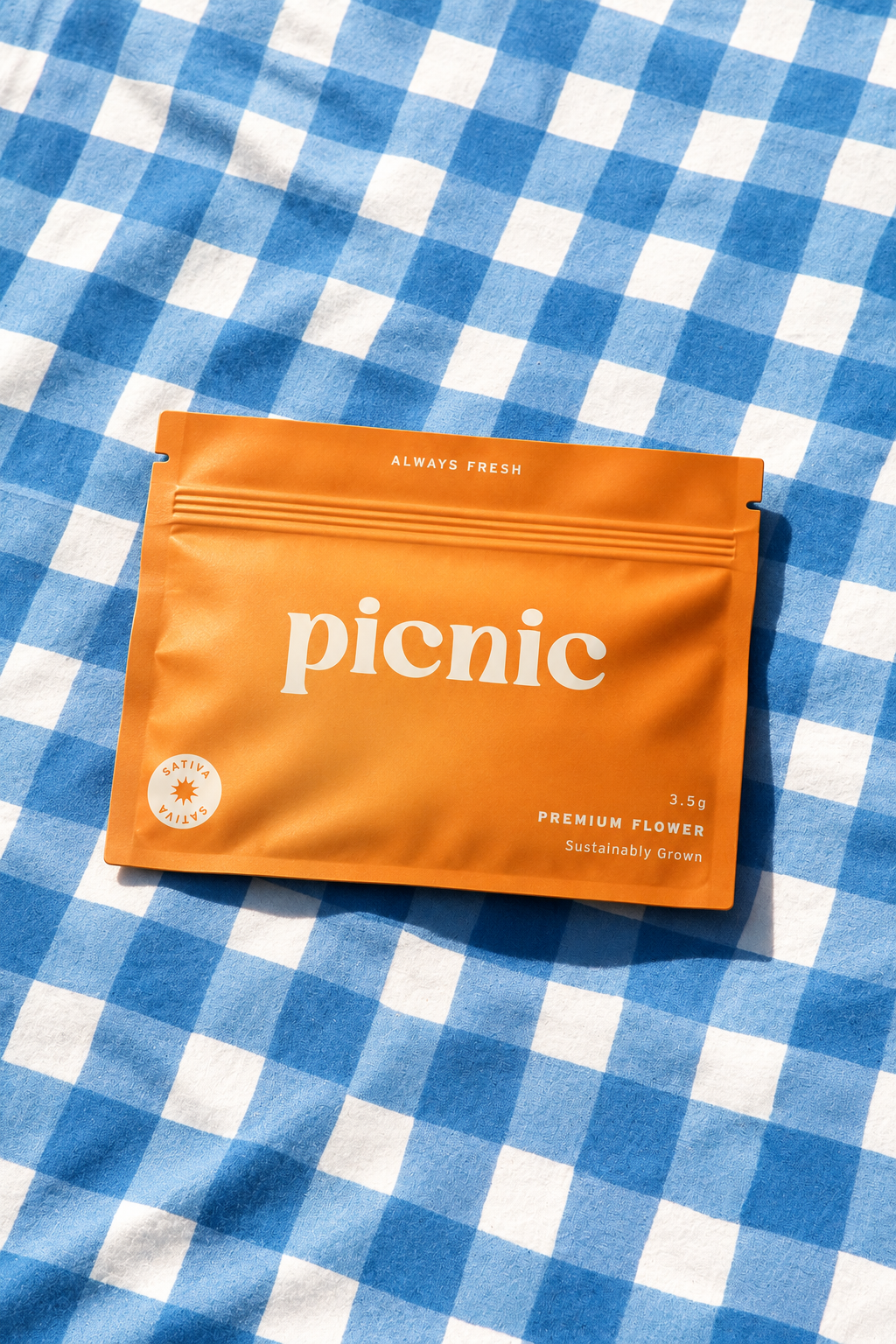
The LookPicnic’s logomark is built from a custom typeface that evokes a sense of modern nostalgia. Its funky character is balanced by a minimalist sans serif, giving the brand a playful yet approachable feel.
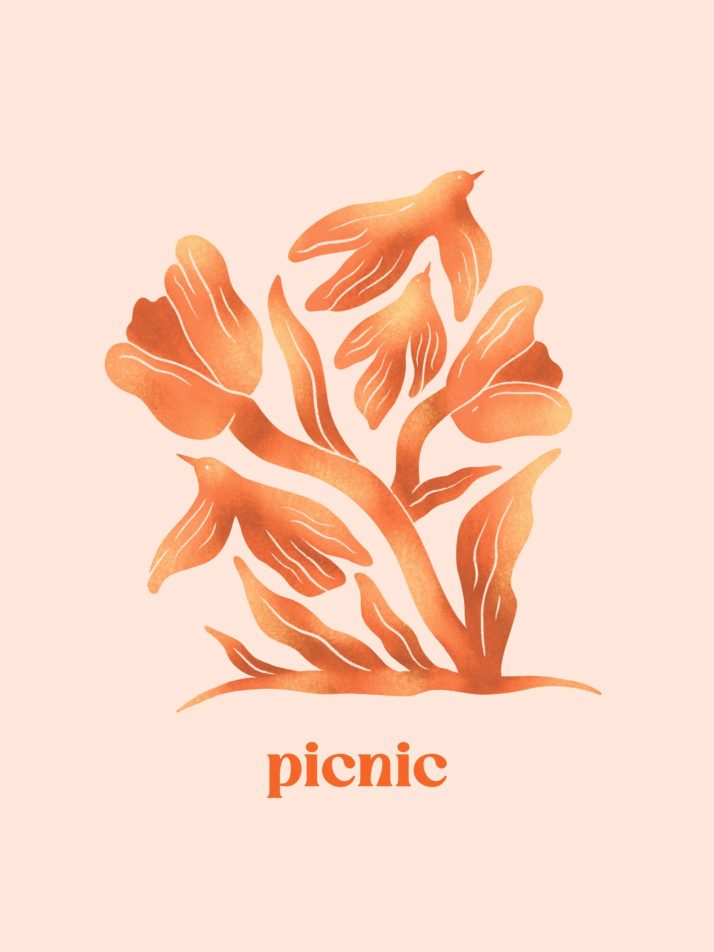
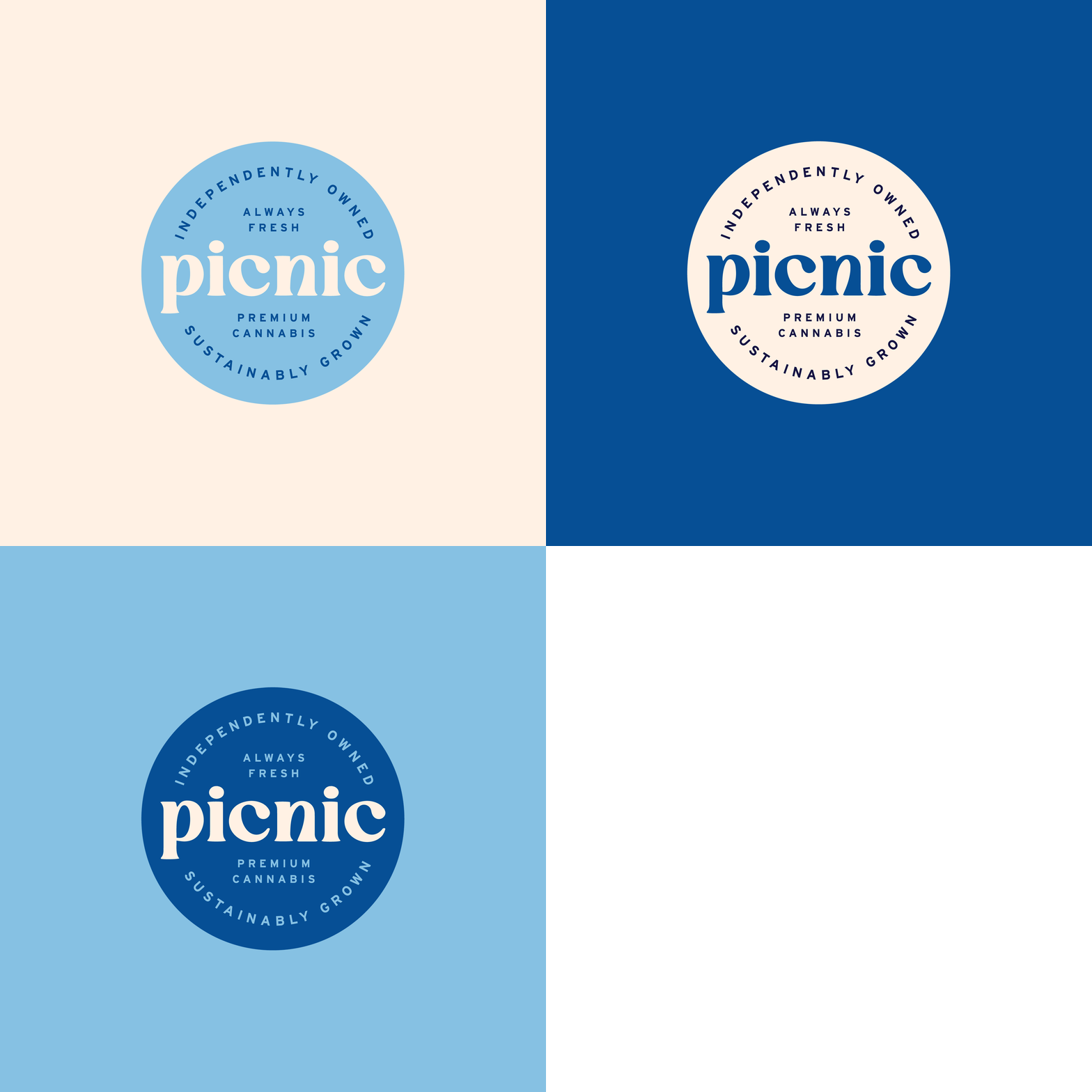
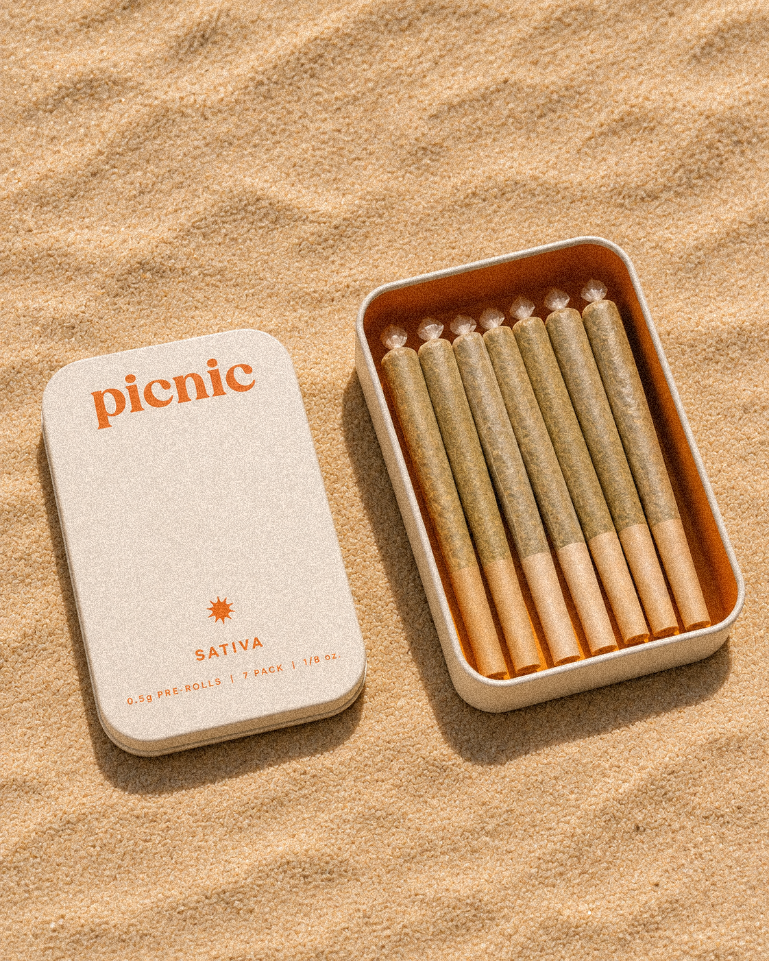
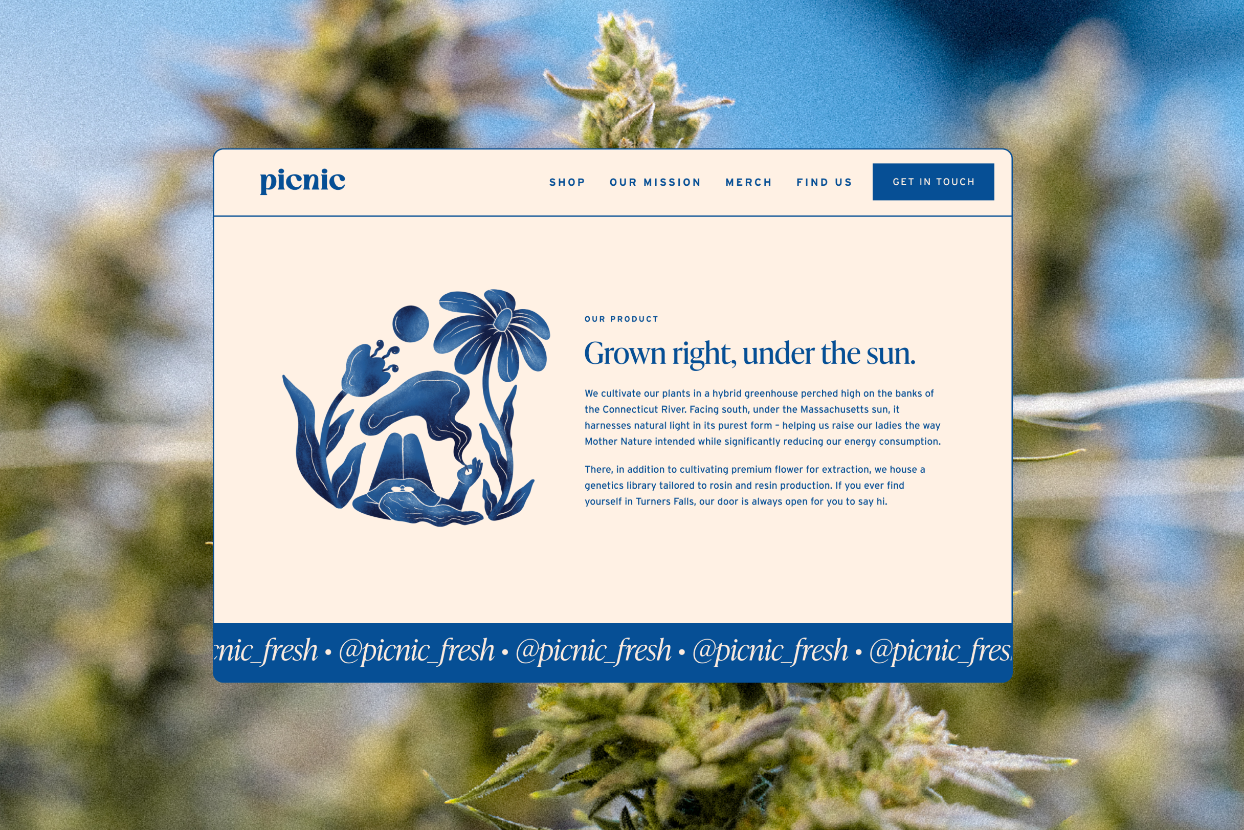
Badges, illustrations, and photography guidelines round out the identity, creating a distinctive world for Picnic.
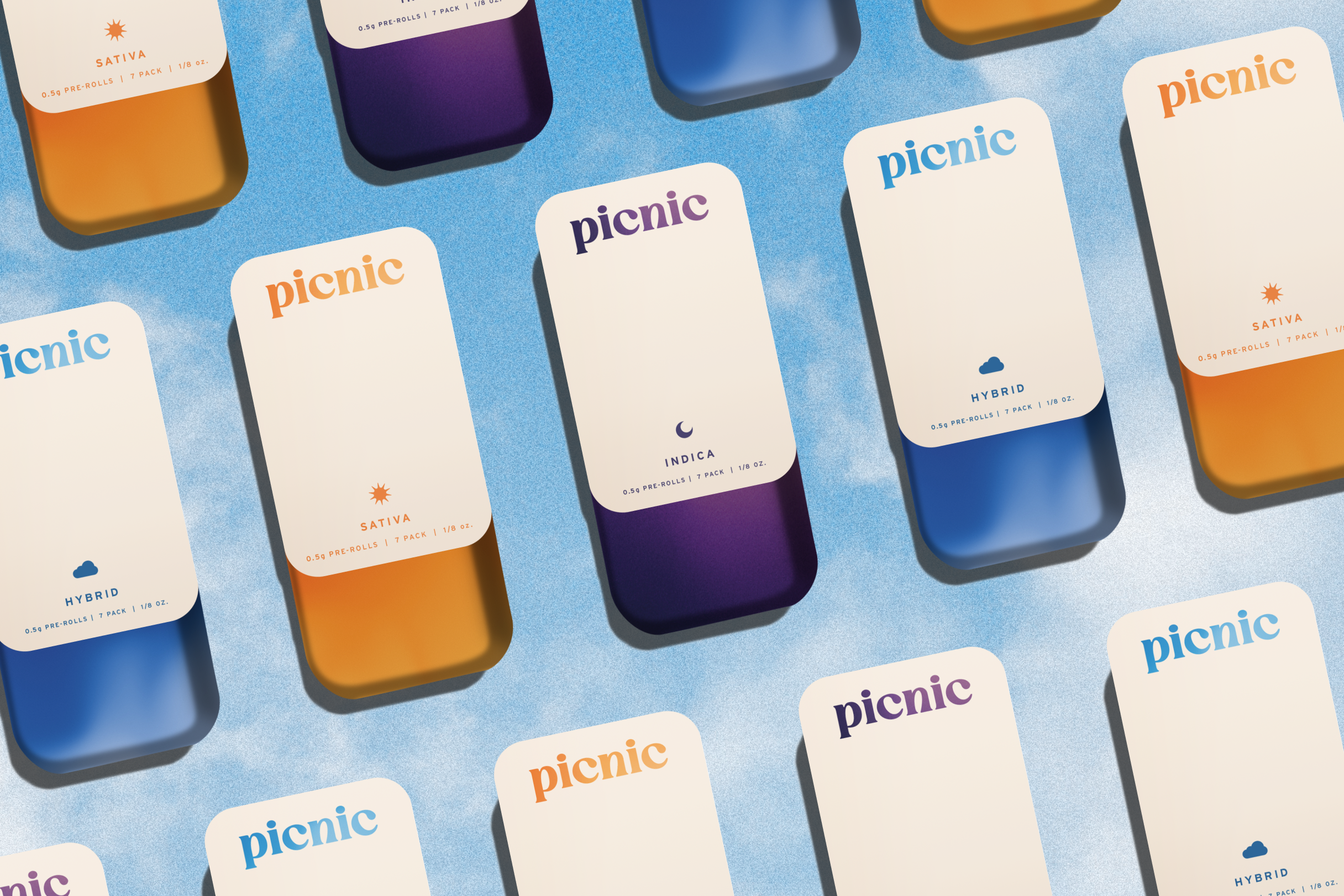
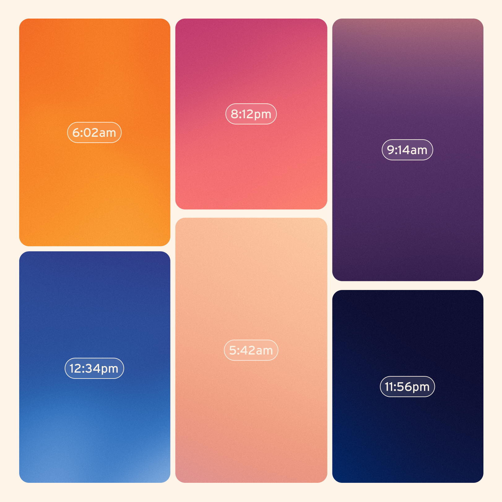
color palettePicnic fits into any time of day. Whether you’re starting your morning with a joint and coffee, enjoying a midday pick-me-up, or winding down for sweet dreams, there’s a Picnic product for your ritual.
The color palette celebrates those moments, taking cues from the sky’s shifting colors and beautiful natural gradients.

illustrations