Appalachian
Mountain Club
role: design director
Services: branding, illustration
team: fair folk
The Appalachian Mountain Club (AMC) has a long history of getting people outside. But after a 2019 rebrand left them feeling a little rocky, they needed help with a fresh new look with a milestone anniversary on the horizon (250 years!) we rolled up our sleeves to bring the club’s spirit back into focus, rebuild trust, and create an identity that felt right at home in the great outdoors.
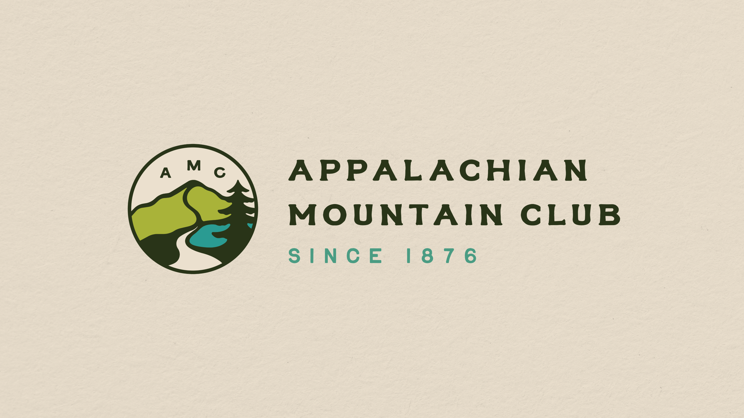
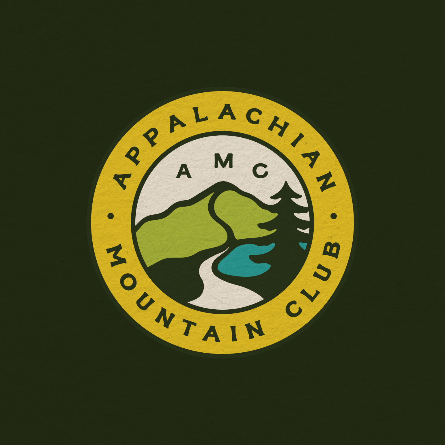
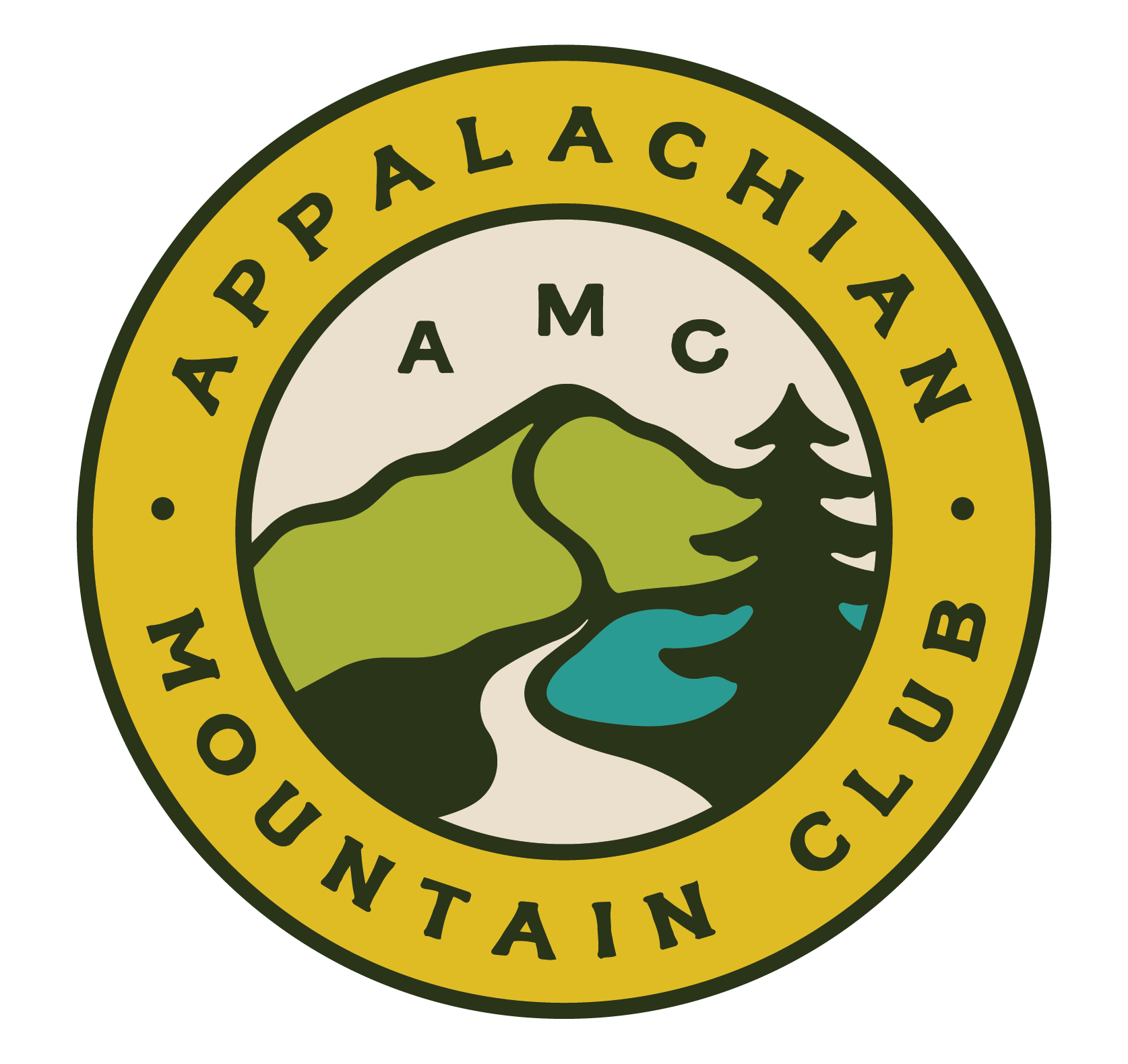
The LogoAMC was seeking to bring some personality back to it’s overall look. They wanted to honor their original logo from the 1800’s, yet bring it into the modern world with elements that showcase what they stand for — preserving and celebrating mother nature. They wanted to incorportate the river, trail, mountain, and tree with a color palette that was pulled from the world around us.
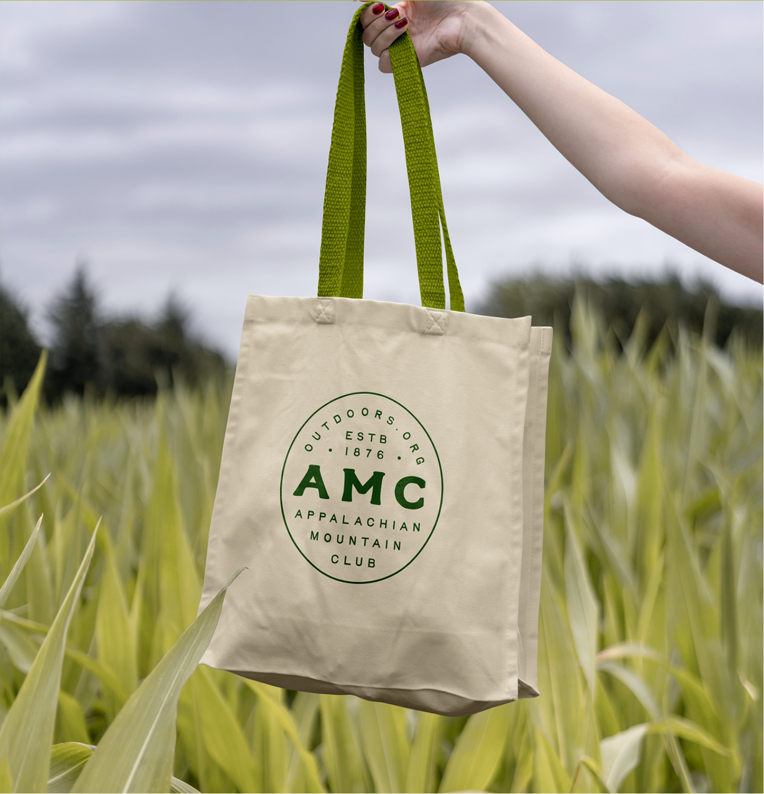
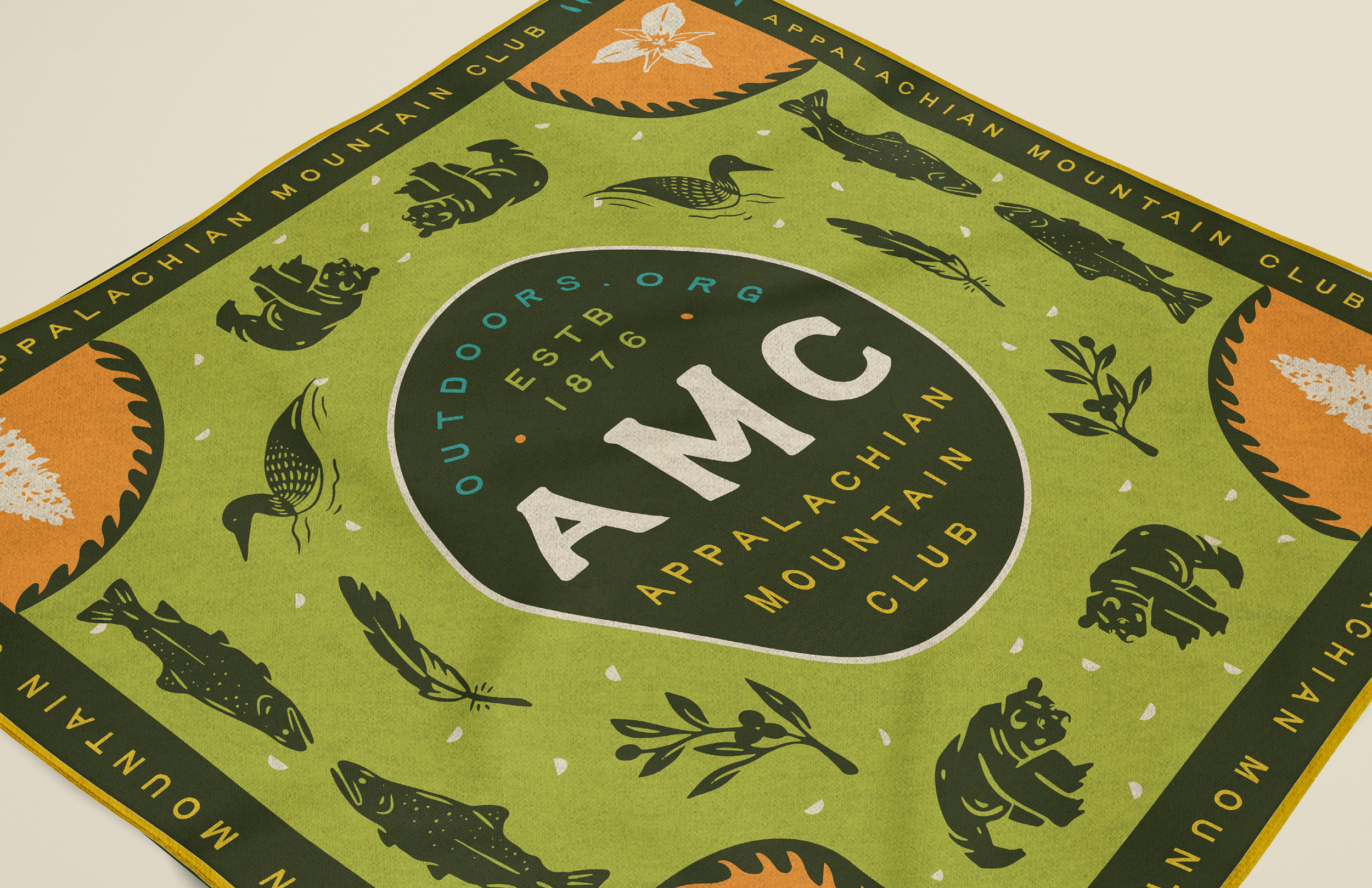
Using a circular logo lockup for the primary look and keeping in mind an illustration style that could easily be carved into trailheads, the new AMC logomark was born. Our colors pull from the earth — forest, water, grass, sunshine and sand. And let’s not forget the saftey yellow for visibility in the woods.
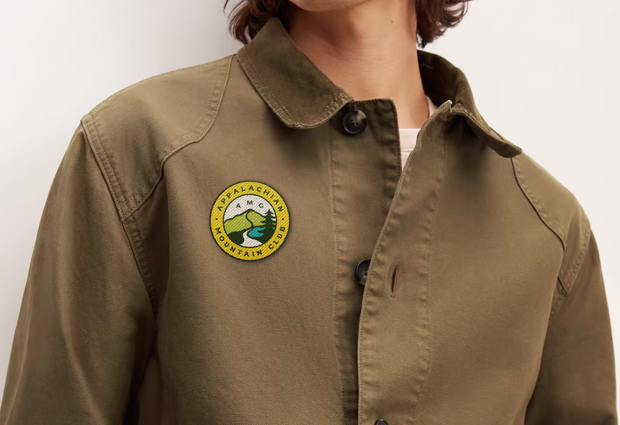
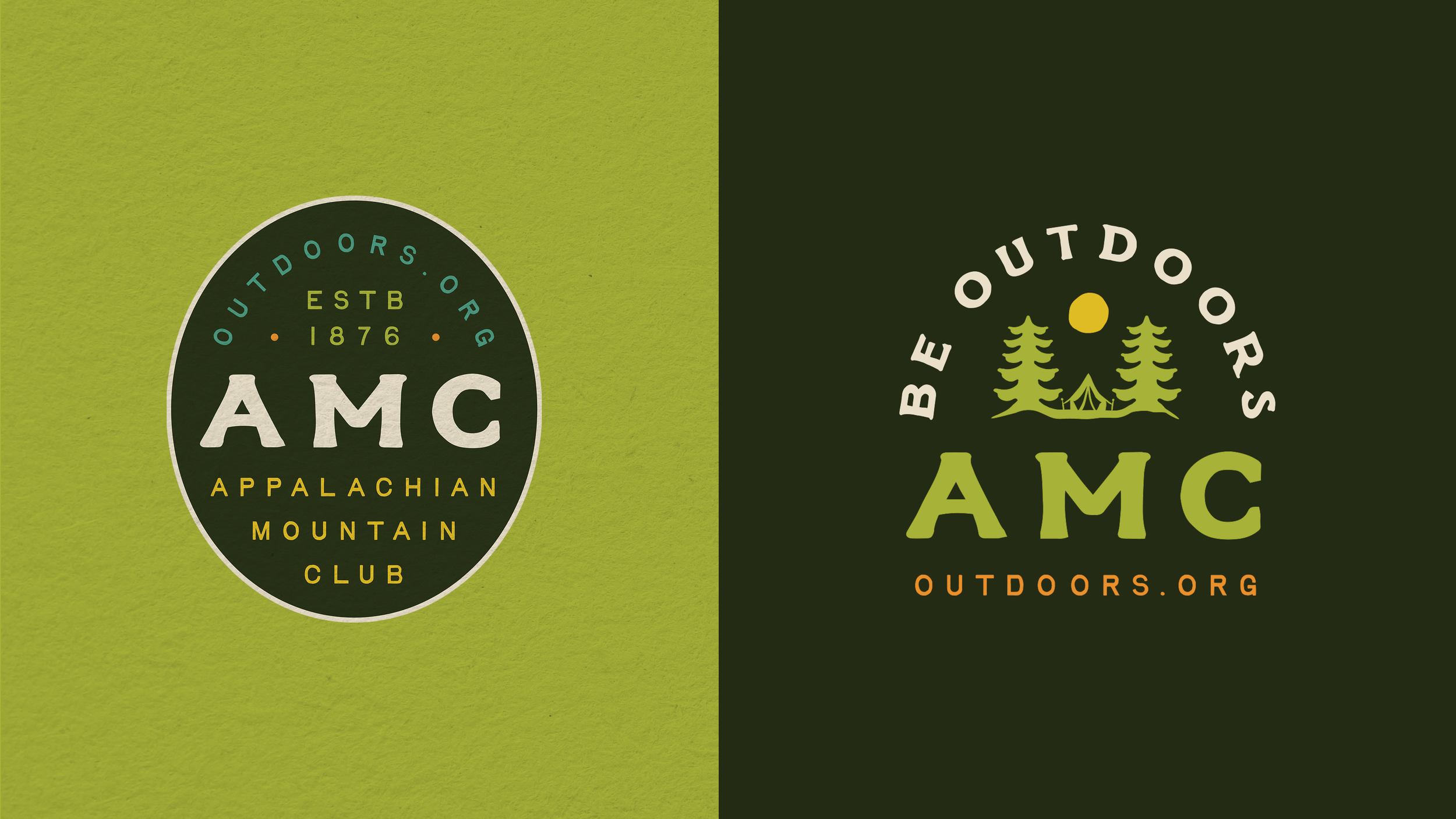
badgesA collection of badges brings a little extra personality to the AMC identity. Using the same colors and typefaces, they take a more playful approach, giving the brand room to roam across merch, social posts, and marketing materials—and giving members something to make their own.
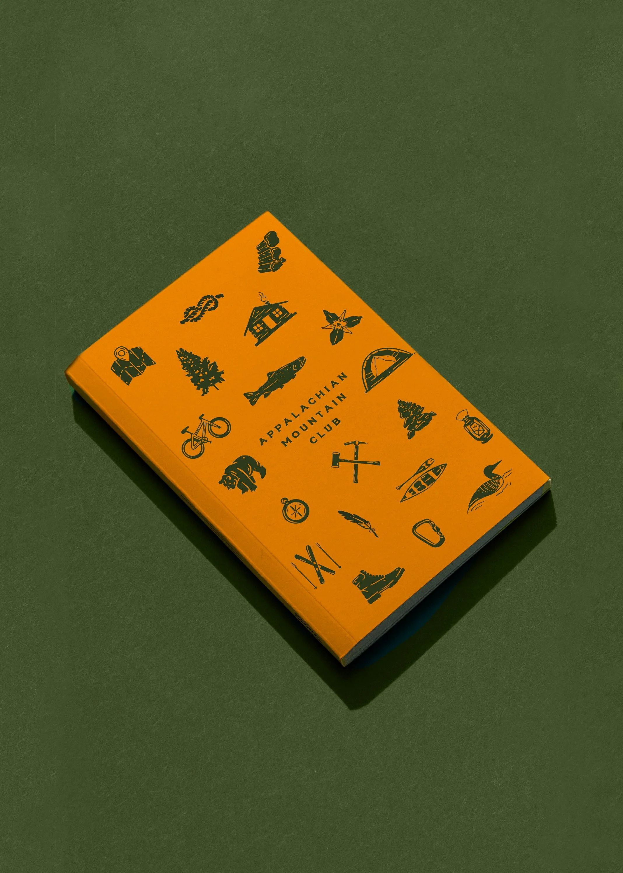
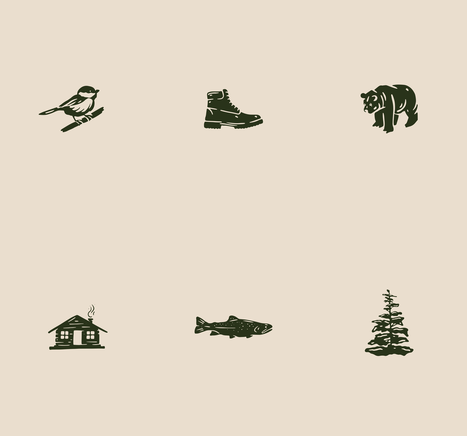
A full set of illustrations rounds out AMC’s new look, celebrating the little things that make the great outdoors so great. Across a range of merch, they bring a playful touch to the gear members can take along on their next adventure.
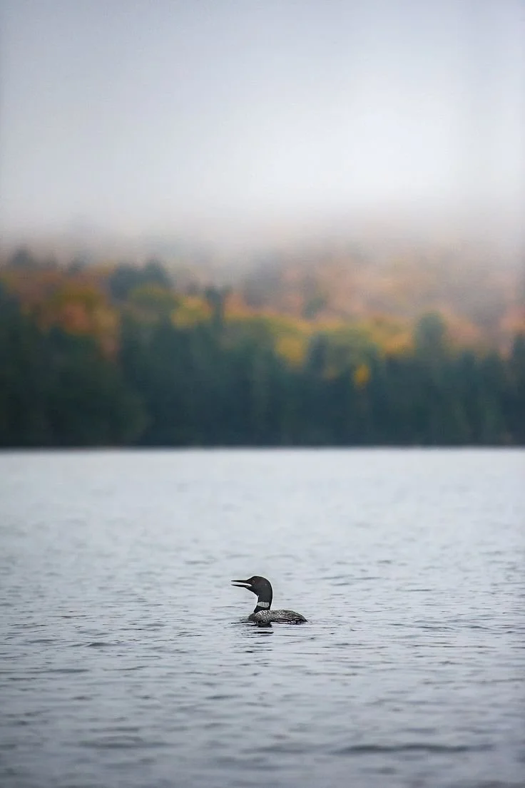
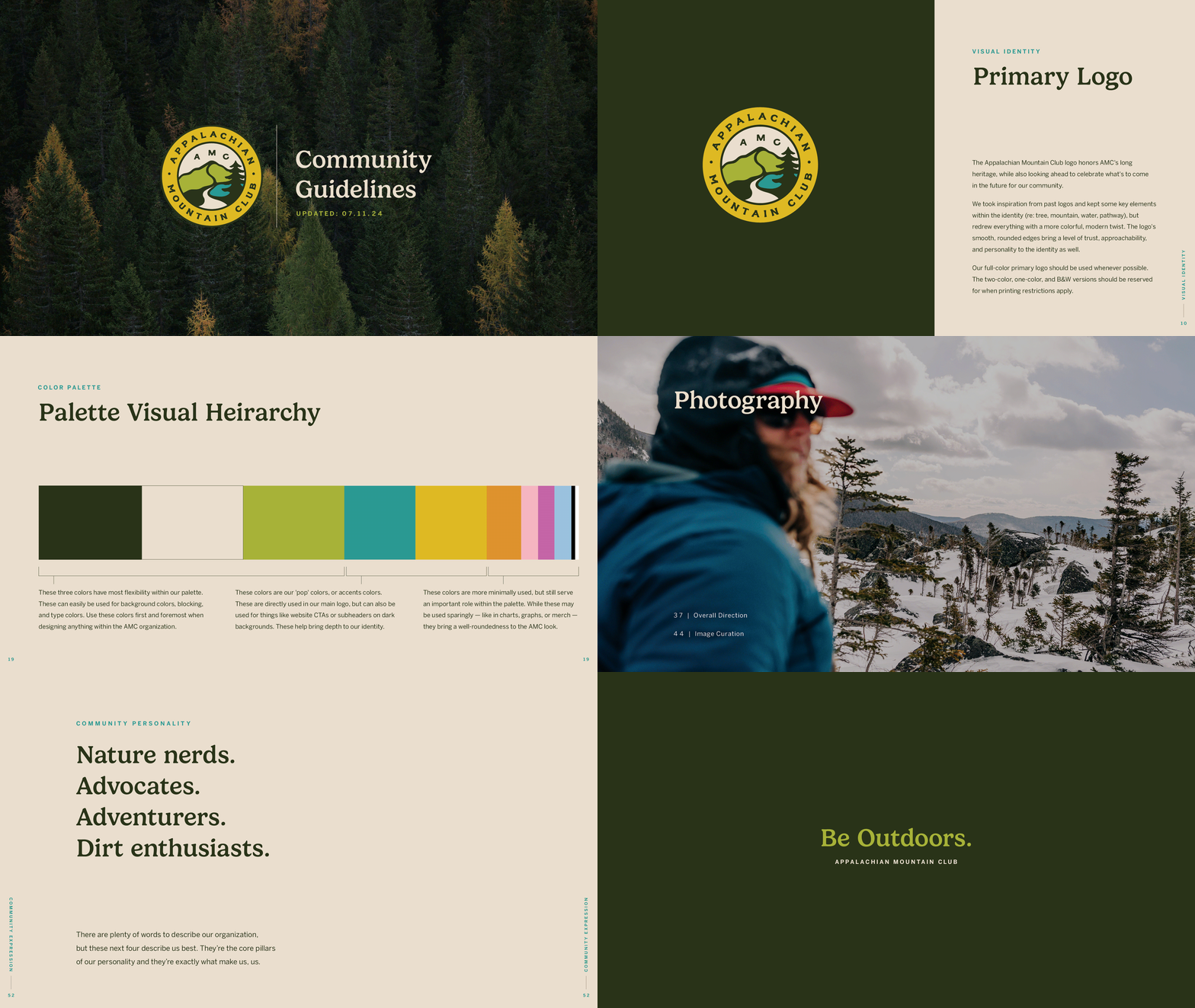
Brand guidelinesThe new identity comes together in a clear, approachable set of brand guidelines. Paired with AMC’s existing photography, the guide lays out how to use the logo and bring the brand to life, making it easy for everyone to get out there and put it to work.